When we started planning version 2.0
of KeymanWeb, we had a couple of major objectives. First, we wanted to
clean up a big chunk of code that had grown beyond its original design and was
getting very difficult to maintain and extend. And second, we knew that
touch devices – tablets and mobile phones, mainly – were an increasingly
important set of devices for entering multilingual data.
 In KeymanWeb 1.0, we provided an API
to allow site developers to create their own user interface for selecting
keyboards, downloading keyboards, and activating various features such as the
On Screen Keyboard, which is not necessarily required for traditional desktop
browsers. In addition, we provided 5 different user interface designs in
the KeymanWeb Subscription service, to make it easier for site developers to
rapidly integrate the tool.
But now, with KeymanWeb 2.0 these
five user interface designs have been updated and made available as an integral
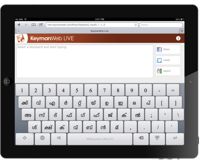
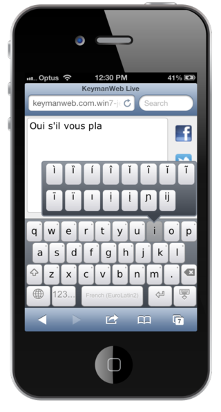
part of KeymanWeb. On touch devices, the desktop-facing user interface is
automatically hidden, and the On Screen Keyboard becomes the only interface for
interacting with KeymanWeb – and given that it is the input surface for the
device, this makes a lot of sense!
Looking back at version 1.0 again, a
significant effort was put into supporting down-level browsers such as Internet
Explorer 5.5 and 6 – which at that time represented a significant segment of
the browser user base. Today, with version 2.0, we are able to abandon
older browsers – for those rare cases where support is needed, use KeymanWeb
1.0 – and build the interface using modern CSS, HTML and JavaScript.
KeymanWeb 2.0 still works with Internet Explorer 8.0, but really hits its
stride with modern standards-compliant browsers such as Chrome, Firefox, Safari
or Internet Explorer 9.0 and later versions. On mobile platforms, we have
targeted Safari Mobile, Android Browser, Chrome Mobile and Internet Explorer
9.0.
Breaking away from supporting legacy
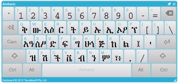
platforms has given us the ability to present the On Screen Keyboard and user
interface far more attractively, with use of modern browser CSS features such
as drop shadows, gradients and curved corners borders. Even better, all
of this is customisable by the web site integrator, so the keyboard can be
tailored to match your site’s décor and design to your heart’s content.
A core objective of the touch device
support was to make the user interface for KeymanWeb transparently adapt to the
user’s device. This meant that when viewed on an iPad, the keyboard would
lock to the bottom of the screen, and the styling of the keyboard would be
similar (although not identical) to the iPad’s brushed metal motif.
Similarly, when moving to an Android device, the keyboard would instead be
light-on-black, mimicking the Android’s built in keyboard.
Jeremy took on the task of producing
the polished keyboard styling, from the mock-ups our graphic designer produced,
and in the process created a fantastic keyboard styling tool, which
dramatically simplifies the task of customising the keyboard style. We’ll
have a separate blog post about this soon!
We also looked at integrating
libraries such as jQuery, which would certainly have made the implementation
simpler. However, we decided against doing this because it increased the
download size substantially, and even though many sites would be using jQuery,
we could not depend on the availability of this library and so would be forcing
visitors to these sites to download two copies of the library – and before you
ask, you can’t rely on the version that the site provides being 100%
compatible!
While KeymanWeb is typically
delivered in a compressed single download, for performance reasons, the source itself has been modularized into several components. These include, among
other things, the core keystroke processing engine, the on screen keyboard, API
interfaces, keyboard management, user interface management and touch
integration. This makes the code more manageable and will make future
releases of KeymanWeb faster and more stable.
The subscription service in version
2.0 has been updated to utilise a Content Delivery Network (CDN) for all the
static elements, including keyboards, fonts, images, and other resources.
This means that KeymanWeb-enabled sites download significantly faster, even
though some of the resources are larger than in version 1.0!
There were many significant
challenges in this project. One of the biggest was that, on most touch
devices, as soon as a text input field is focused, the built-in system keyboard
is activated – and cannot be disabled! This required some lateral
thinking to solve, and we eventually had to build our own custom text fields to
overcome this.
Another challenge was how to support
the plethora of screen sizes and resolutions, across various browsers, without
compromising the high quality of KeymanWeb’s keyboard display. John
solved this through some clever use of CSS scaling features, and by creating a
custom keyboard widget font for all of the graphical elements of the keyboard
display.
 Even such a seemingly simple task as
scrolling turned out to be a major hurdle. While a traditional scroll was
reasonably achievable, the bouncy smooth scroll that iOS has popularised took a
lot of work – it was all too easy to end up making the keyboard scroll, due to
bugs in various browsers. But we solved it – or John did!
Behind the scenes, the Keyman
keyboard language has been updated to support a number of additional features,
such as touch-and-hold menus, custom keyboard layers and custom keys, simple
branching, logic and persistent data – think user preferences on punctuation,
for example – and platform sniffing, to allow a single keyboard to adapt itself
to mobile, tablet and desktop platforms. We’ll be exploring these in
detail in another blog post shortly.
A big new release of Keyman
Developer, with full support for all of these new features is also coming
up. It will provide graphical design tools for your keyboards as well as
letting those hard-core coders among you delve into the source, as
always! Keyman Developer’s fully-featured source debugger has also been
updated to allow you to test your mobile layouts directly within Keyman
Developer, without having to go through the compile-install-test
rinse-and-repeat tedium common to mobile web development. We’ll talk about
this more when we release the beta preview.
In our next blog post, we’ll take
you through the process of integrating KeymanWeb 2.0 into a blog site, together
with a video. We’ll explore elements such as keyboard selection, user
interface integration, mobile adaptability and more.


0 thoughts on “KeymanWeb 2.0: The Development Story”