As part of the Keyman Desktop 8.0 release work, we needed to give the Tavultesoft website some attention: the pages were looking dated, and the content had grown over time and was getting out of control. The Tavultesoft website has thousands of pages of content, and finding the right content was becoming increasingly difficult.
This blog is a description of how we redesigned the home page. The new home page will be going live soon, and we'll be doing some more testing once it has gone live, with you, our users!
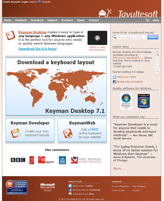
Here's the existing home page:
First we brainstormed what we want to communicate on the home page. This gave us 5 key groupings for content:
- Confidence: Quality, you can trust us
- Information: Who we are, what we do
- Call to action: Download, buy, contact, learn more
- Currency: News, we are still alive
-
Blather: Copyright, navigation, other necessary evils
We also quickly went through how someone could end up at this page. This is not a comprehensive list but just to get us thinking about what the purpose of the page is.
- "Tavultesoft" or "Keyman" search – word of mouth or existing knowledge
- "Tamil Keyboard" – i.e. type in a specific language, looking for a solution for their language.
- Links from other sites (word of mouth)
- "Create a keyboard": Developer
-
"Type online": KeymanWeb.
We realized that the core role of the home page is really confirmation: yes, I'm in the right place, this is where I want to be. So the messages and content need to be structured around communicating that message and moving the user onto their final destination as quickly as possible.
Then we took the existing home page and broke it down as best we could into those areas.

Here's a key to the colours in the diagram:
Red – Confidence
Orange – Information
Green – Call to action
Blue – Currency (news)
Black – Blather
This helped us to see the following, among other things:
- We had no clear call to action anywhere on the page.
- Messages and actions are hopelessly muddled in the key areas of the page – the product information areas. What's more, it was not clear that any of the key product links were clickable.
-
We have a big emphasis on trust and confidence – all the red areas in the graphic above.
We then scored each area subjectively. This was a muddled value about how effective we think the area is, and also how attractive. This was really quick and just to give us a quick picture of what we react to on the page. This is not a number that indicates how important the item is!

It was a bit embarrassing to realize that the links for the products scored so poorly in our subjective review.
Now it was time to throw away the old and brainstorm the new. Armed with the ideas of what is important to communicate, we came up with the following wireframe:

We spent more time designing the Keyman Desktop, KeymanWeb and Keyman Developer sections. Under those three boxes goes Testimonials and Customer Logos on the left, and News and Community Links on the right.

We were not sure what graphic to use for the Keyman Desktop box. We could have a screenshot of Keyman, a happy user photo, or a graphic – e.g. a map, or some conglomeration of Unicode characters.
A lot of this seems obvious in hindsight. But it often seems to take a lot of work to get there!
You'll note the video link is not included at present – because it needs to be reworked for Keyman Desktop 8 and I think we'll be too busy on everything else to get it done for release. We'll work on the video post-release.
We have also redesigned the banner at the top and the navigation for the site, as you'll see in the image below.
And here's what we have come up with for the final page (note, the footer is not finalized).
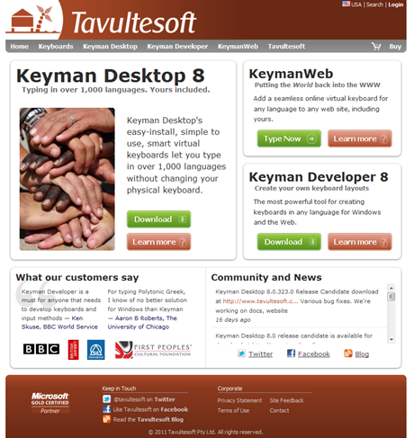
What do you think?
1 thought on “Designing the new Tavultesoft home page”
Amy Isham · May 20, 2011 at 12:02 pm
I like it, but I’m not sure why you didn’t go with Home1,2,3 or 4? 🙂